


A Survivor 46 Cast (Clothing) Analysis


In a similar vein to my last post: ‘A Caricature of Oneself‘, Survivor contestants also assume the singular aesthetic of a cartoon character: generally, they have one outfit that they wear throughout the course of an entire season. Moreover, these outfits are meant to distinguish them and represent their personalities (think Boston Rob’s iconic hat, Omar’s bright orange, quirky bird shirt, etc.)
Inspired by ‘Issa Look’, which features Survivor 28 pre-merge boot Brice Izyah judging contestants solely based on their cast photos, today I will be judging our novel cast solely on their outfits. Unlike Bryce, I do unfortunately have some extra knowledge regarding these contestants, but I will attempt to extricate those conceptions from my subsequent analysis.
In alphabetical order…
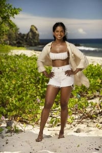
We begin with a gem of an ensemble from Jem.
My girl has seamlessly coordinated her cream and ivory striped swim top with her ivory shorts and a cream button down. It’s flattering, aesthetically pleasing, and my only criticism would be that the swim top appears slightly structurally unsound. And the gold hoops? chefs kiss
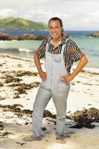
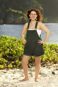
Post-Jem, a tough act to follow, comes Ben
Now I see what Ben was going for (quirky, fun, eclectic dude). However, the execution is shoddy. His overalls look so cheap, are poorly fitting, and have pockets even more impractical than those typically seen on women’s garments.
I do like the black and white striped tiger print shirt. However, I think the denim color does not complement it at all. I would have preferred to see some olive green or grey, thicker (and less cheap-looking), overalls or cargo pants maybe.
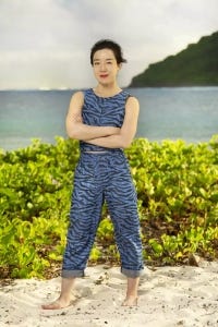
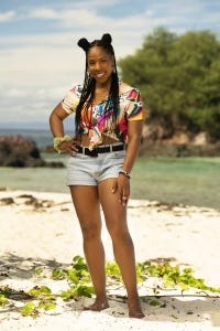
Just wait though, because next up, we have Jess!
Jess slays. The house. Boots down. (kitty kitty purr)
The zebra print? Love it. The matching top/bottom set? Flattering, well done, and eye-catching.
What’s more? She designed and sewed the entire outfit herself.
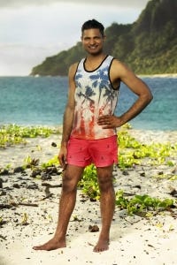
After that masterpiece, we get a masterfully ugly outfit from Mr. Bhanu
I love Bhanu’s energy, but by god is this outfit atrocious. The first thing I notice is the two disparate shades of red (a warm-toned red in his shirt, directly contrasted with his cool-toned red shorts)– super unappealing. Then we have the tank itself, which looks like something dropshipped from China, and bought at the beach while partying in Miami for 4th of July. The black piping outlining the tank is also way too harsh for the rest of the outfit.
The shorts are good, and would have worked well with so many other top choices. Just not this one.
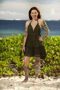
Who’s up? It’s Kenzie…
You know what’s also up? My rating of Kenzie’s outfit. The red hair, and olive green dress are stunning together. The dress also perfectly shows off and complements her tattoos.
Gorg! And I have nothing else to say.
Alrighty, it’s time for Charlie.
Charlie looks like he borrowed his grandpa’s shirt, and then accidentally shrunk it in the wash, yet saw the palm trees on it and thought ‘Ah yes, this will be perfect for living on a beach while on national television’.
The shorts are boring, and would have worked with a cooler top, but unfortunately in that, Charlie lacks.
Let’s talk about Liz.
This may be my least favorite outfit so far. The shorts are poorly fitting, have cheap looking material/cuffing, and are an unflattering length. The acid wash denim paired with the denim shorts, in a completely different shade, is 2000s denim-mania executed utterly horribly.
I like the yellow top– Good color, and it fits well. I even like the red headband. But together, with the multi-denim and rainbow glasses, this outfit is just way too discombobulated.
Jelinksy? More like jankyyyy.
Oh such a funky name for someone who looks like they bought the first thing they saw while shopping in the Ross summer sale section. This entire outfit looks extremely cheap.
I don’t mind the idea of drawstring denim, but I do hate this particular wash and cut of Jelinsky’s shorts. The top is absolutely atrocious. A fake ripped-off-sleeve hoodie is like distressed jeans on steroids. I hate the concept. I hate the execution. And I hate the perfectly uninteresting blue color.
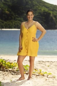
How do you solve a problem like Maria?
Well, honestly this outfit isn’t really a problem. But it’s also not really very exciting either. The color and cut is nice. The gold hoops are cute. It’s just a bit boring.

How about Hunter?
Hunter’s shirt is a very nice shade of blue. If he has some special inclination towards pineapples, then I approve. Otherwise, mehhhh. Hunter’s shorts are slightly too long and wide on him and the fabric could be more structured. Tweak the bottoms and this outfit is a success.
Moriah. More like ‘More eye-sore ahhhh!’
A tube top with overalls? No, just no. The overalls are also slightly too baggy. Also, Moriah is unfortunately the second redhead in this cast to sport olive green, and it’s not done as well, so it comes off very uninspiring.
Q…
Has decided to unbutton his shirt to the godsss. Sure he’s got a fine chest, but this doesn’t look good on anyone. The grey shorts don’t go well with the lavender checkered top. Moreover, the super light purple is far too low-saturation for his complexion. IMO Q wanted flattering, but got far from it.
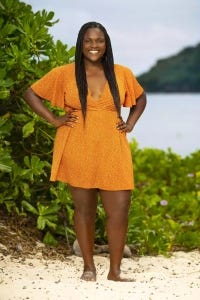
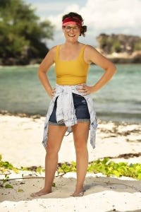
Soda? More like Pop!
Because Soda pops in orange. Her dress has a pretty silhouette, if only a tad unremarkable.
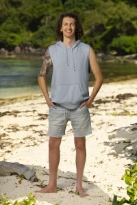
Randen said ‘I am boring. ‘
He said, ‘I will wear the most basic thing. possible and you cannot form any opinion of me, positive or negative.’
Not spending any more time on this outfit, than Randen spent picking it out. Next!
Tiffany pulls a more artsy Liz here.
She wears a multicolor shirt, paired with denim, a black belt, and a puke green scrunchie. Messy Messy Ms. Tiffany. She clearly tried, but all together, these pieces do not look good. Ditch the scrunchie. Swap the blue denim for some black linen pants and we’d be talking.
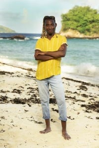
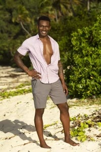
Time to talk about Tevin.
On the surface, I like it. The top is a nice shade of yellow, especially with Tevin’s hair. I don’t mind the cuffed, capri jeans. But both items do look a bit cheap.
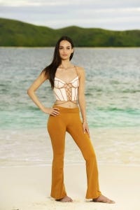
Venus Vafa, such a beautiful girl, in such an ugly outfit.
The two shades of orange don’t match. The top could be nice, but paired with yoga pants, combines to look straight off of Shein. A long white skirt, or white pants would have been sooo much classier here.
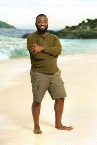
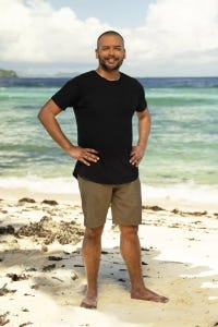
Tim tries out monochrome, and he works it.
I like the Henley, I like the not-quite-a-cargo short, and I like the two shades of green together. My man slays here.